


2025


(DATA)
Semester 4, Visual Communication,
IDCE HGK Basel
Module: Editorial Design
Lecturer: Prof. Marion Fink, Mathias Remmele
(DE)
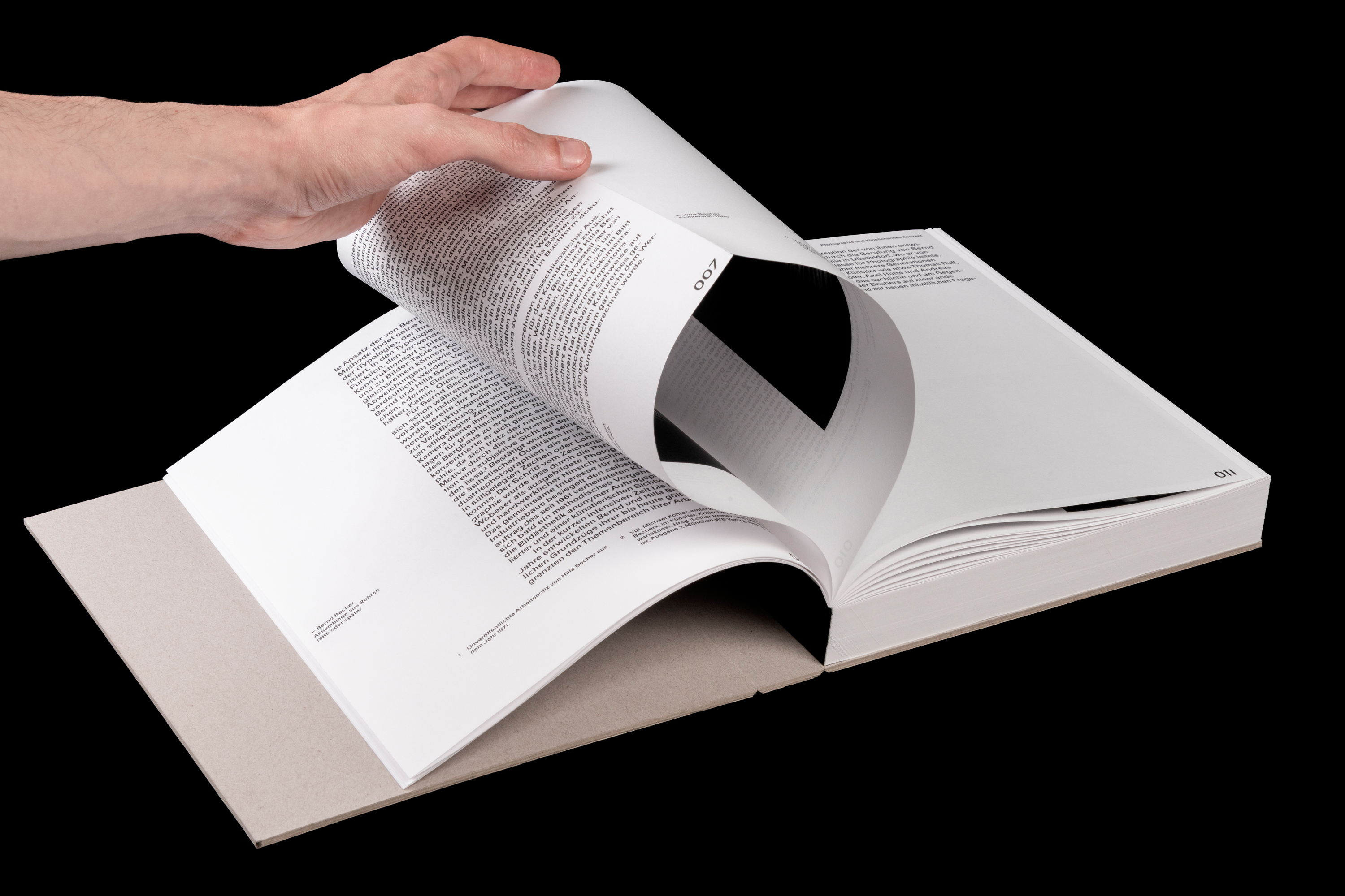
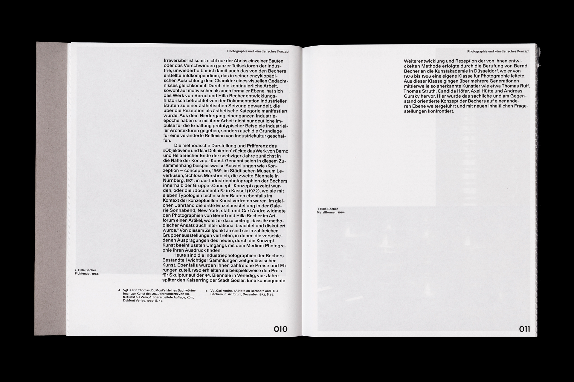
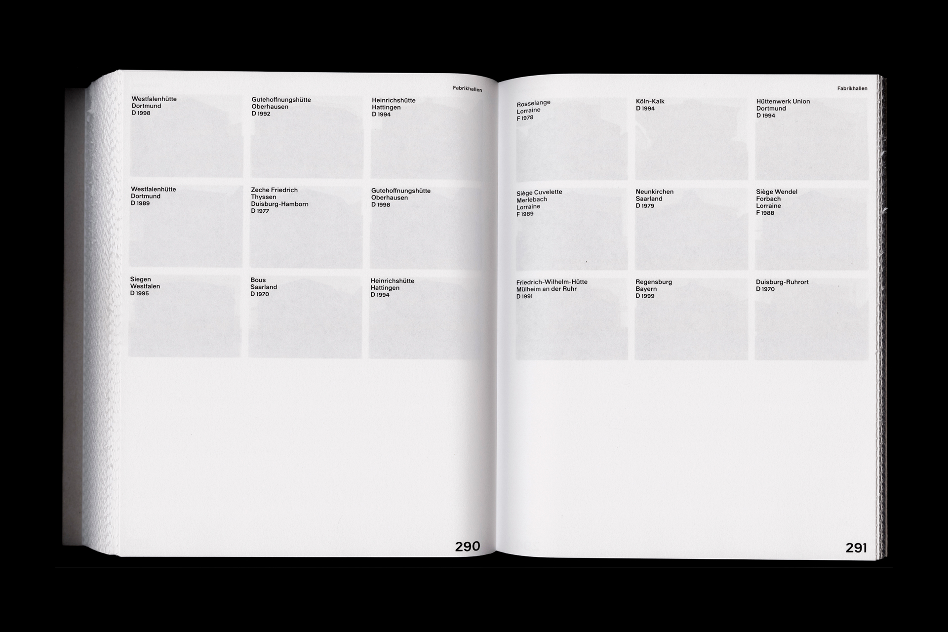
Dieses Buch zeigt das Werk von Hilla und Bernd Becher aus einer neuen Perspektive. Neben den strengen Typologien rücken die Orte und die von Organisation und akribischer Planung geprägte Arbeitsweise in den Fokus. Ergänzt durch frühe Arbeiten der beiden wird sichtbar, wie sich ihre sachliche, archivarische Bildsprache entwickelte. Großformatige Einzelaufnahmen verdeutlichen den Detailreichtum ihrer Fotografien. Durch die japanische Bindung bleiben die Bilder zunächst verborgen – sichtbar sind nur Texte, Daten und Standorte. Wer mehr entdecken möchte, muss die Seiten auftrennen und die Fotografien selbst erschliessen. Ein Buch, das dazu einlädt, sich die Bilder und ihre Kontexte aktiv zu erarbeiten.
(EN)
This book presents the work of Hilla and Bernd Becher from a new perspective. In addition to their strict typologies, the focus shifts to the locations and their working method, shaped by organization and meticulous planning. Early works by the duo further reveal how their objective, archival visual language developed. Large-format individual images highlight the richness of detail in their photographs.Due to the Japanese binding, the images remain hidden at first – only texts, data, and locations are visible. Those who wish to discover more must cut open the pages and explore the photographs themselves. A book that invites the viewer to actively engage with the images and their contexts.
2025

(DATA)
Semester 4, Visual Communication,
IDCE HGK Basel
Module: Impulsworkshop Type Design
Lecturer: Prof. Philipp Stamm
(DE)
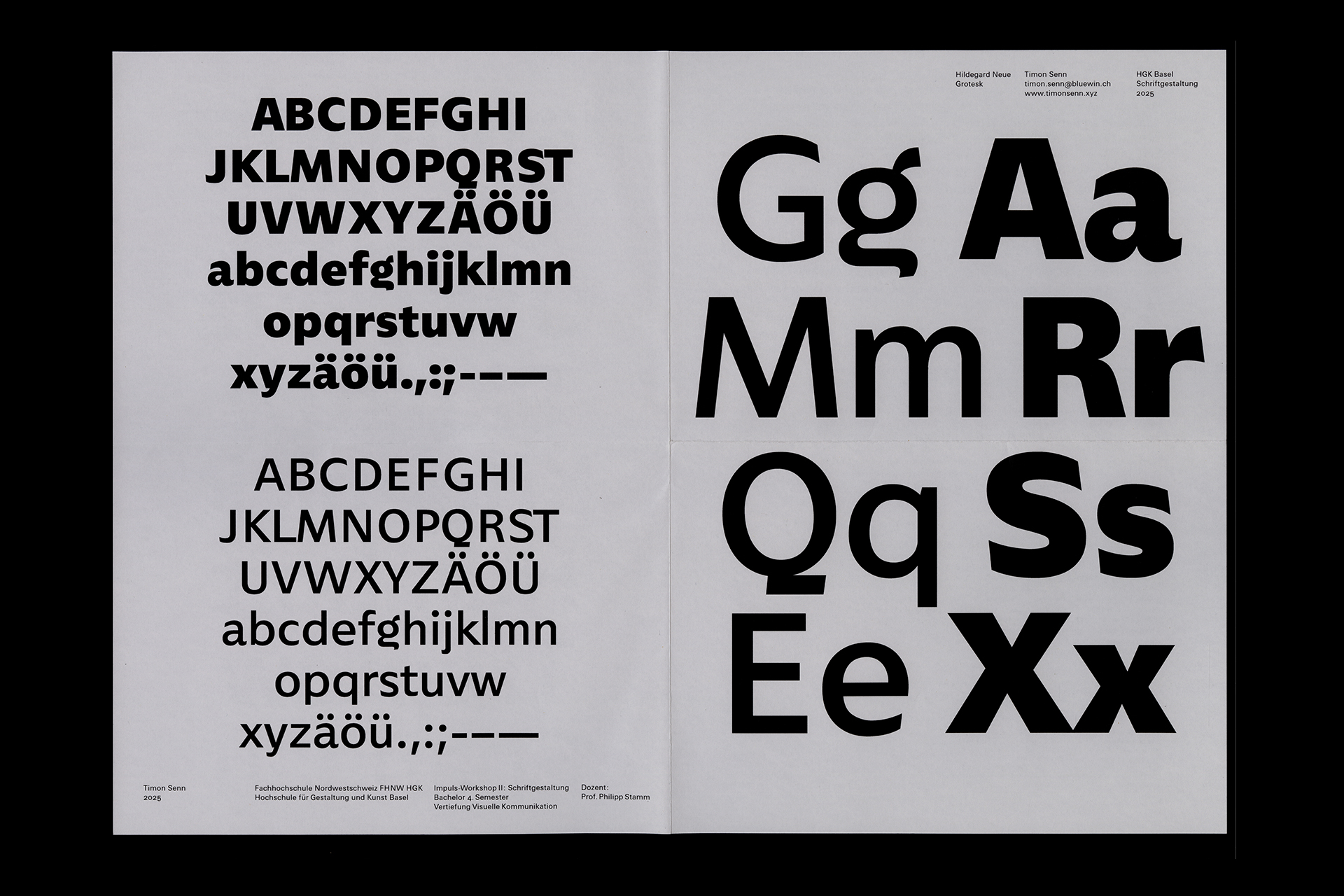
Im zweiwöchigen Impulsworkshop Type Design bei Prof. Philipp Stamm entstand der Entwurf Hildegard Neue – eine variable Sans Serif mit dynamischen, humanistischen Formen, inspiriert von Schriften wie Gill Sans und Gotham. Durch ihre sehr hohe x-Höhe sowie kurze Ober- und Unterlängen wirkt sie in grossen Grössen plakativ, während sie in kleineren Grössen trotzdem sehr gut lesbar ist. Weitere Schnitte mit vollständigem Zeichensatz und Sonderzeichen sind in Arbeit – stay tuned!
(EN)
The Hildegard Neue typeface was developed during the two-week impulse workshop Type Design with Prof. Philipp Stamm – a variable sans serif with dynamic, humanist forms, inspired by typefaces such as Gill Sans and Gotham. With its very high x-height and short ascenders and descenders, it appears bold in large sizes, while still maintaining excellent readability at smaller scales. More weights with a complete character set and special characters are in progress – stay tuned!
2024


(DATA)
Semester 3, Visual Communication,
IDCE HGK Basel
Module: Book Typography
Lecturer: Jinsu Ahn
(DE)
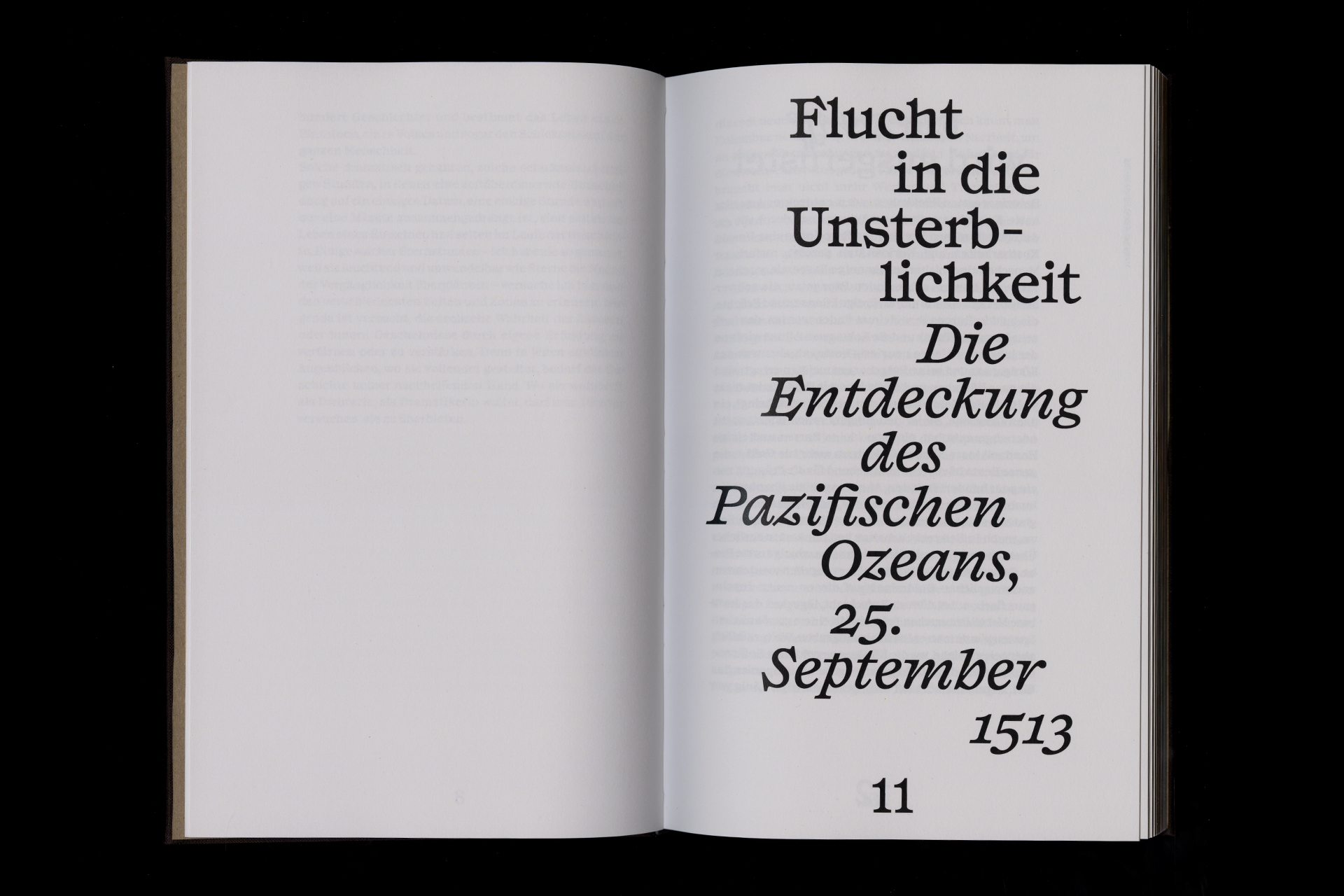
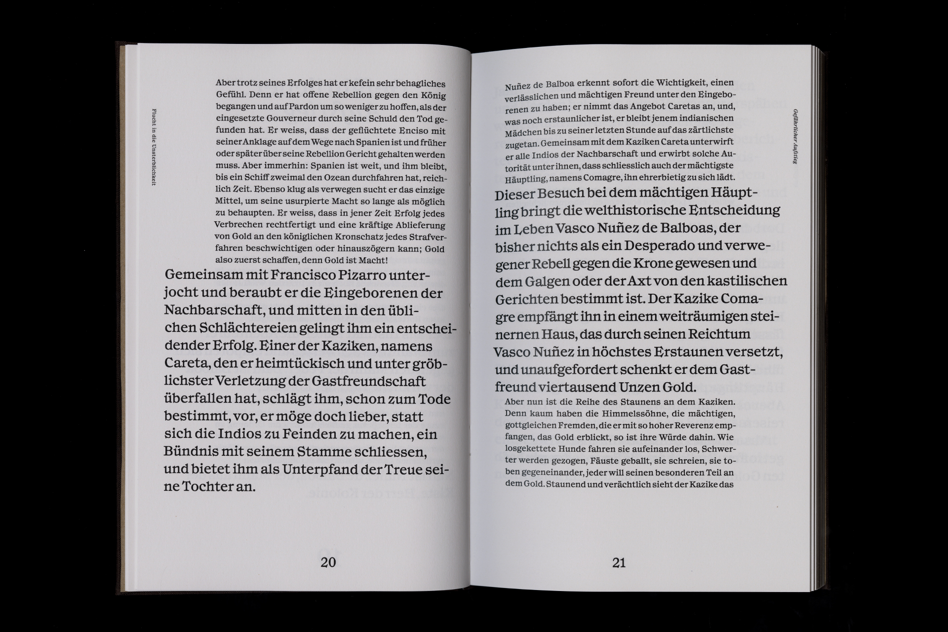
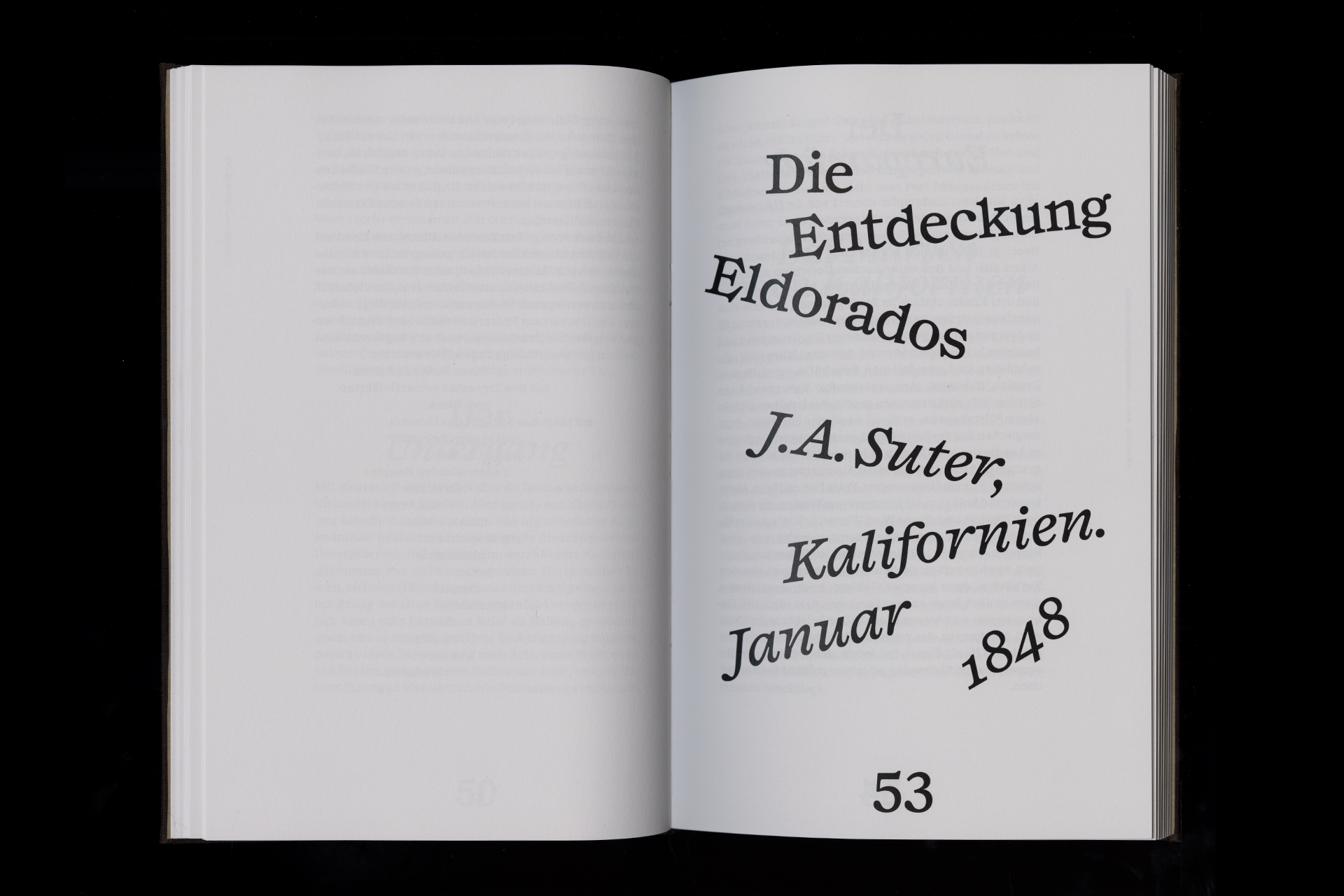
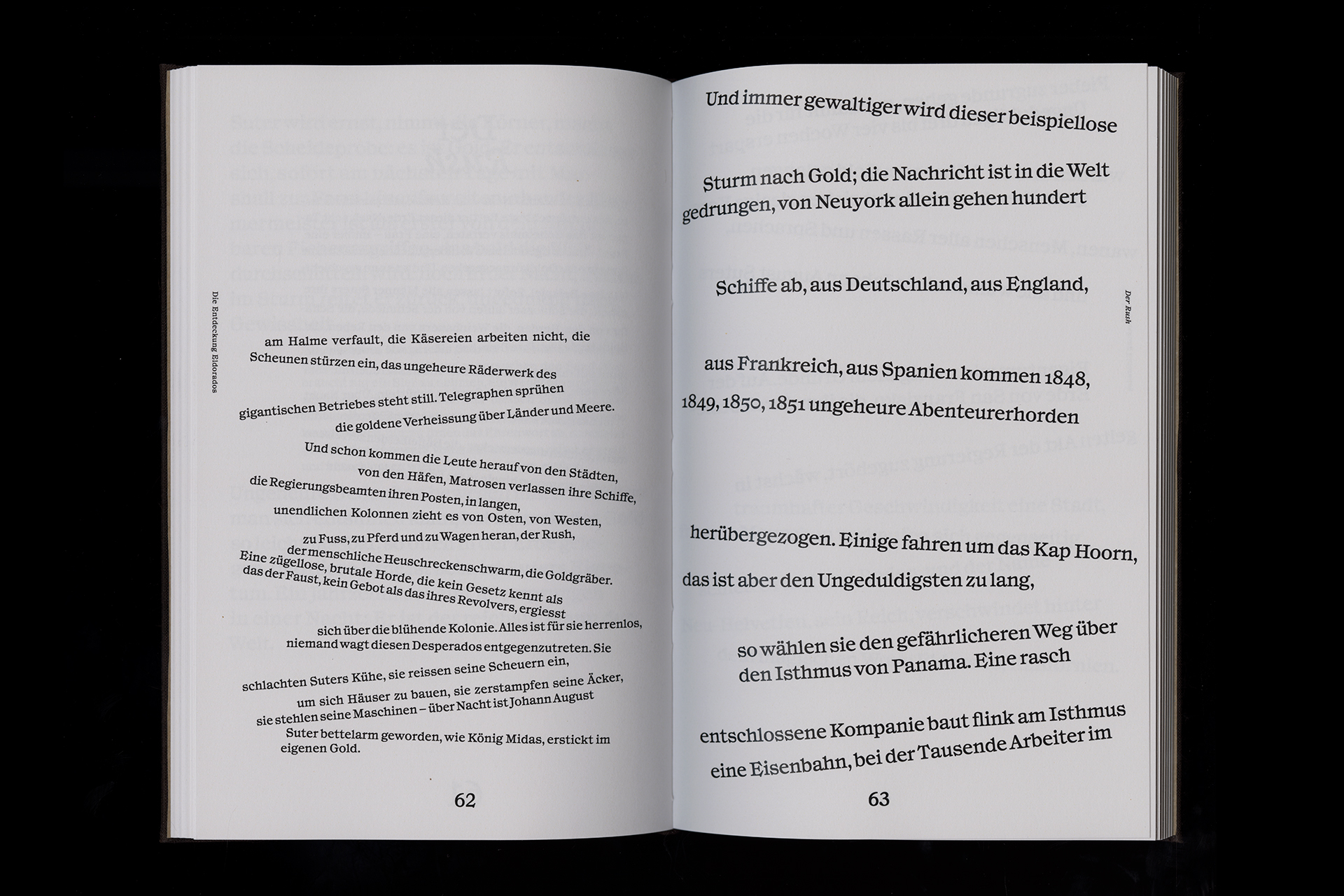
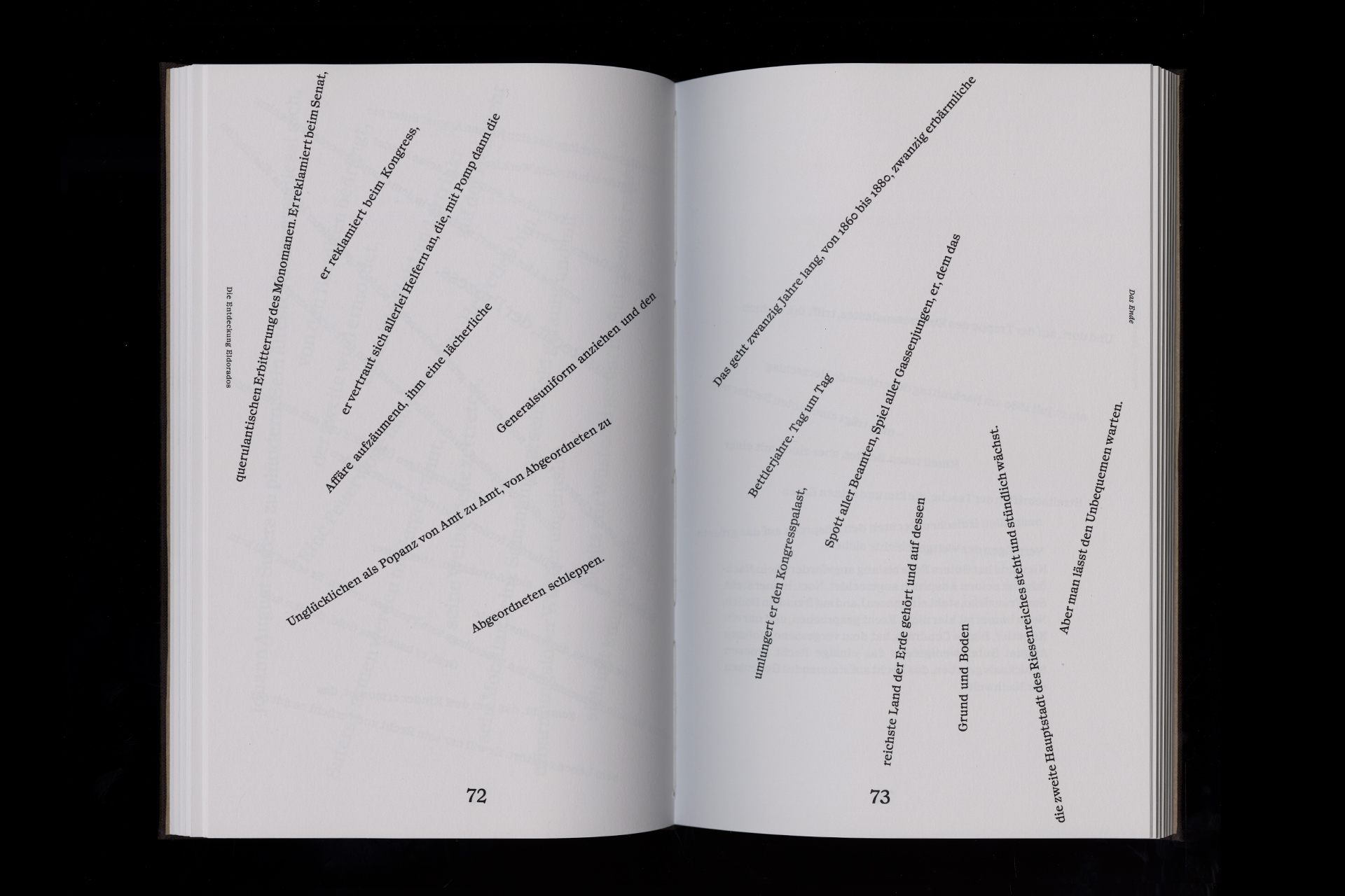
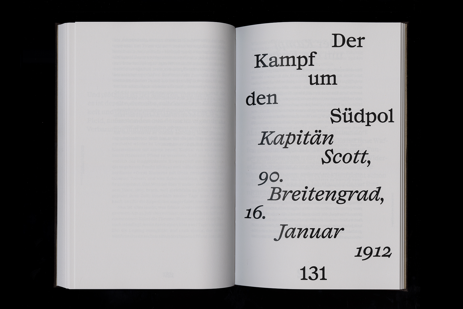
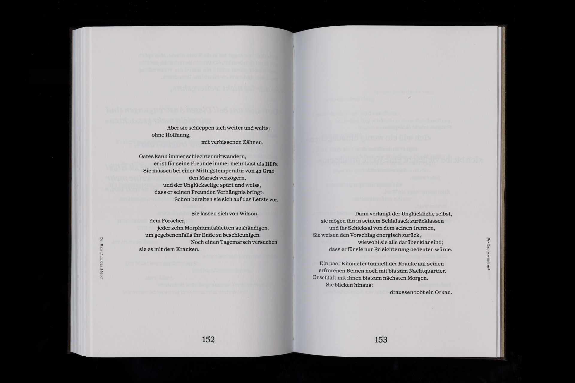
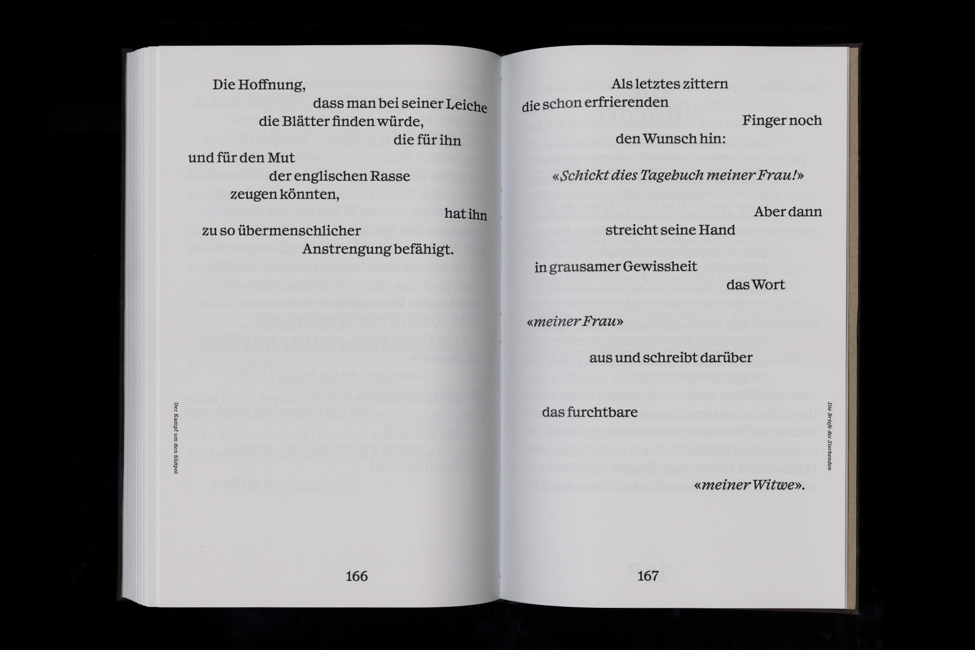
Für die Gestaltung von Sternstunden der Menschheit von Stefan Zweig stand die Verbindung von historischer Sachlichkeit und erzählerischer Tiefe im Fokus. Die typografische Umsetzung greift diese Dualität auf: Mit der Schriftart Syncro in Book und Italic entsteht ein Spannungsfeld zwischen Klarheit und Ausdruck. Der Satzspiegel folgt dem Goldenen Schnitt, wird jedoch punktuell durch asymmetrische Elemente gebrochen – als visuelles Echo auf die Erzählstruktur des Buches. Besondere Passagen wurden individuell bildlicher inszeniert: etwa durch sich verändernde Zeilenführung oder typografische Verdichtung. So wird jede Geschichte auch formal erlebbar. Der Umschlag mit Weltkarte und zweifarbigem Druck unterstreicht die globale Relevanz der historischen Momente.
(EN)
For my design of Sternstunden der Menschheit by Stefan Zweig, the focus was on the connection between historical objectivity and narrative depth. The typographic concept reflects this duality: Using the typeface Syncro in Book and Italic creates a tension between clarity and expression. The layout follows the principles of the Golden Ratio, but is occasionally broken by asymmetrical elements – a visual echo of the book’s narrative structure. Key passages were individually staged: for example, through changing line flow or typographic compression. In this way, each story becomes a formal experience as well. The hardcover with a world map and two-color print emphasizes the global relevance of these historical moments.
2024


(DATA)
Semester 3, Visual Communication,
IDCE HGK Basel
Module: Imagination
Lecturer: Viola Diehl
(DE)
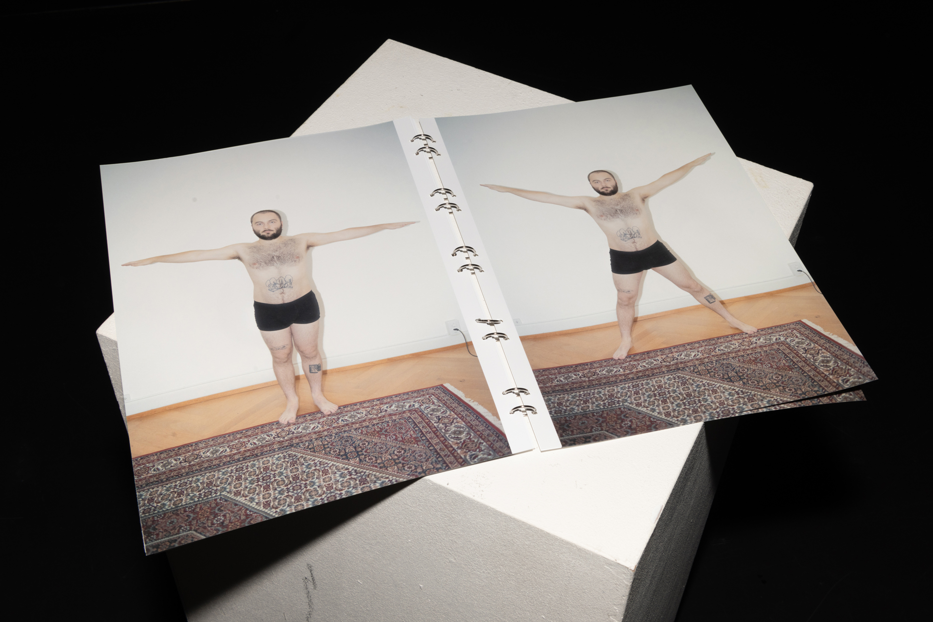
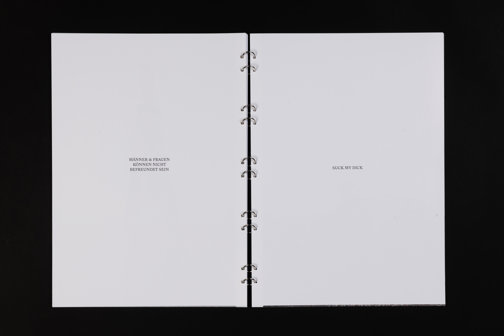
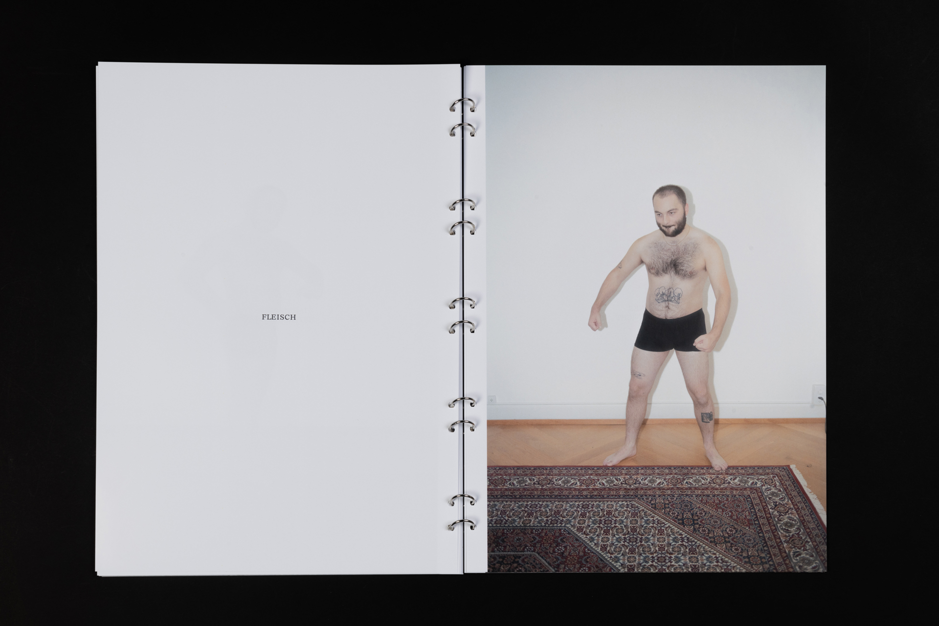
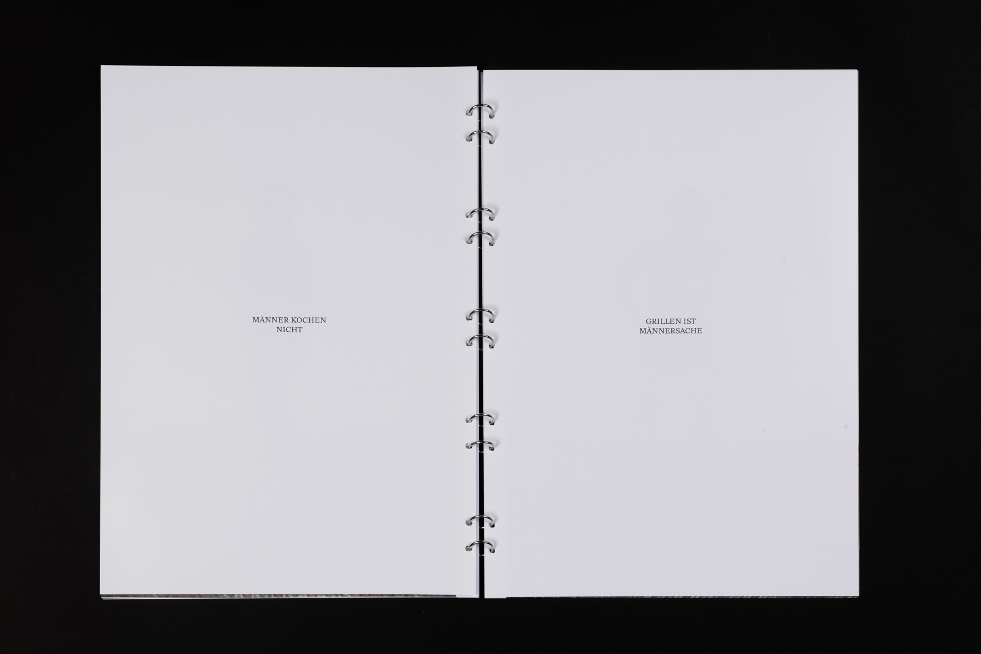
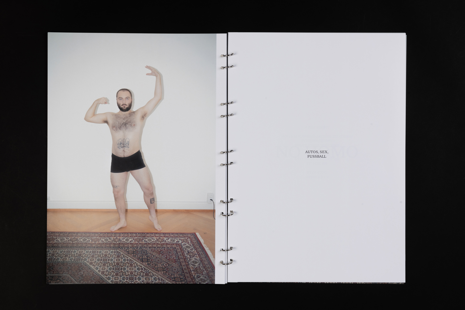
Toxische Männlichkeit ist im Zeitalter des Internets ein grösseres Thema denn je. Der starke, grosse, aggressive und erfolgreiche Mann wird als Ideal dargestellt, was besonders jungen Menschen ein unrealistisches Bild vermittelt.
Mit «NO HOMO» will ich ein Zeichen gegen diese toxische Männlichkeit setzen und das gesellschaftlich verankerte Bild des «idealen» oder typischen Mannes hinterfragen. In einer Bildserie inszeniere ich mich selbst in ikonischen Posen aus Popkultur, Kunst und Bodybuilding und stelle diese verschiedenen Wörtern und Texten gegenüber. Durch die Kombinationen aus Bild und Text entstehen neue Aussagen und Fragen, mit welchen das Publikum konfrontiert wird. Gebunden ist die Serie durch 10 Ringe, wodurch die Publikation über keinen klaren Anfang und kein klares Ende verfügt, so wie auch das Thema toxische Männlichkeit nicht einfach abgeschlossen werden kann.
(EN)
Toxic masculinity is a bigger issue than ever in the age of the internet. The strong, tall, aggressive, and successful man is portrayed as the ideal, which conveys an unrealistic image—especially to young people. With “NO HOMO”, I want to take a stand against this toxic masculinity and challenge the socially entrenched image of the “ideal” or typical man. In a series of images, I stage myself in iconic poses from pop culture, art, and bodybuilding, contrasting them with various words and texts. These combinations of image and text create new statements and questions that confront the audience. The series is bound by ten rings, which means the publication has no clear beginning or end—just as the issue of toxic masculinity cannot be easily resolved.
2024

(DATA)
Semester 2, Visual Communication,
IDCE HGK Basel
Module: UX/UI II
Lecturer: Thomas Bircher
(DE)
In UX/UI II bei Thomas Bircher bekamen wir die Möglichkeit, uns mit Webdesign auseinander zusetzen und mit den interaktiven Funktionen zu experimentieren. Über sechs Tage habe ich versucht die Grenzen des Programms Figma mit interaktiver Typografie auszuloten und habe die entstandenen Experimente in einer fiktionalen Website gesammelt. Schau dir den interaktiven Prototypen hier selbst an!
(EN)
In UX/UI II with Thomas Bircher, we were given the opportunity to get to grips with web design and experiment with interactive functions. Over six days I tried to explore the limits of Figma with interactive typography and collected the resulting experiments in a fictional website. Have a look at the interactive prototype yourself here!
2024


(DATA)
In Collaboration with Giuana Bachmann
Semester 2, Visual Communication,
IDCE HGK Basel
Modules: Typography II, Time Based Media II
Lecturers: Marion Fink, Fabian Kempter
(DE)
Für unser Semesterprojekt mit dem Titel "Architektur und Licht" gestaltete ich zusammen mit Giuana Bachmann ein Plakat und einen animierten Teaser zum Habitat Weinlager auf dem Lysbüchel Areal in Basel. Das Gebäude wurde 2023 von Esch Sintzel Architekten zu einem Wohnhaus umgebaut und bietet günstigen Wohnraum für eine diverse Mieterschaft.
In unserer Umsetzung fokussierten wir uns auf die markante Trapezblechfassade und deren Spiel mit Licht. Durch die grafische Umsetzung der Schatten und die darin integrierte Typografie entsteht ein Flimmern, welches mit der Nah- und Fernwirkung spielt. Je größer die Distanz zum Plakat ist, desto leserlicher wird die Typografie. Dieses Auftauchen und Verschwinden der Typografie haben wir auch in der animierten Umsetzung aufgegriffen. Dabei wollten wir mit dem Ton zudem den Wandel vom Industriebau zum lebendigen Wohnhaus darstellen.
(EN)
For our semester project entitled "Architecture and Light", I worked with Giuana Bachmann to design a poster and an animated teaser for the Habitat Weinlager on the Lysbüchel site in Basel. The building was converted into a residential building by Esch Sintzel Architekten in 2023 and offers affordable living space for a diverse tenant base.
In our realisation, we focused on the striking trapezoidal sheet metal façade and its interplay with light. The graphic realisation of the shadows and the integrated typography creates a flickering effect that plays with the near and far effect. The greater the distance to the poster, the more legible the typography becomes. We also picked up on this appearance and disappearance of the typography in the animated realisation. We also wanted to use the sound to depict the transformation from an industrial building to a living residential building.
2024


(DATA)
In Collaboration with Vivienne Degen
Semester 2, Visual Communication,
IDCE HGK Basel
Module: Photography II
Lecturer: Kambiz Shafei
(DE)
Seit meiner Kindheit ist mein Lieblingsort der Wasserfall in meinem Heimatdorf Diegten. Die riesige Felswand über den der Wasserfall hinunter fliesst wirkte auf mich schon immer wie eine Landschaft auf einem anderen Planeten. Für das Modul Fotografie II versuchten Vivienne Degen und ich diese eigenartige Landschaft mit farbigem Blitz fotografisch einzufangen. Mit einer Serie von 11 Detailaufnahmen von Steinstrukturen bei Nacht wird der Wasserfall in Diegten zu einem interplanetaren Raum.
(EN)
Since my childhood, my favourite place has been the waterfall in my home village of Diegten. The huge rock face over which the waterfall flows has always struck me as a landscape from another planet. For the Photography II module, Vivienne Degen and I tried to capture this strange landscape photographically with coloured flash. With a series of 11 detailed shots of stone structures at night, the waterfall in Diegten becomes an interplanetary space.
2022


(DATA)
neues kino basel
Programme: Jean-Michel Müller, Daniel Gelzer, Hanspeter Gysin, Palästina Komitee
Print: Rumzeis
(DE)
Mit dem Dezemberprogramm 2022 zeigte das neue kino basel eine beeindruckende Reihe aus Spielfilmen von palästinensischen Filmemacher:innen. Vom 15. – 17.12. standen unter dem Titel "Palästina Filmtage" Dokumentarfilme zu Gaza, zur Auseinandersetzung mit der Siedlerbewegung und der Instrumentalisierung des Antisemitismusvorwurf gegenüber Kritiker:innen der Politik des Staates Israel auf dem Programm, für deren Programmation Palästina Solidarität Basel zeichnet. Als Gestaltungselement für das Plakat dient der Olivenzweig, ein Symbol für Palästina wie auch für den Frieden.
(EN)
With its December 2022 programme, neues kino basel presented an impressive series of feature films by Palestinian filmmakers. From 15 – 17 December, the programme entitled „Palästina Filmtage featured documentaries on Gaza, the debate about the settler movement and the instrumentalisation of accusations of anti-Semitism against critics of the policies of the state of Israel, with Palestine Solidarity Basel responsible for the programming. The design element for the poster is the olive branch, a symbol of both Palestine and peace.
2022


(DATA)
Semester 8, Berufsmaturitätsschule AGS Basel
Module: Gestaltung, Kunst und Kultur
Lecturer: Daniel Tschumi
(DE)
Für ein Schulprojekt unter dem Titel «Metamorphose» experimentierte ich mit Typografie und verschiedenen Pixelrastern. Durch die Auflösung der organischen Formen in geometrische Formen entstehen neue abstrakte Formen. Entstanden sind drei Schriftschnitte, inklusive rounded Varianten, mit denen als Produkt ein Plakat gestaltet wurde.
(EN)
For a school project entitled "Metamorphosis", I experimented with typography and various pixel grids. By dissolving the organic forms into geometric shapes, new abstract forms are created. I created three typefaces, including rounded variants, which were used to design a poster.
all rights reserved


